Posted in All posts, Audience feedback, Research | Leave a Comment »
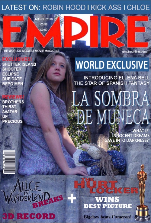
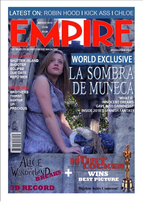
Initially I was happy with my magazine however after beginning audience feedback there has been specualtion as to whether the cover is really speaking anything to the audience. The picture I think works well as a main image for a cover even though it doesn’t quite fit with the tone of the movie, because it’s rather light and girl almost looks content. The main way to change it was to change how the text on the front cover was referring to the image so rather than it be focussed on a general feature of the movie I could point it in the direction of say the actress as that’s more what magazines tend to do plus it would mean I could keep the original image rather than start completely over, so here it is now >>> 
Posted in All posts, Final Construction | Leave a Comment »
I’ve kept the second poster pretty much the same except the image of the faded girl which I’ve changed to one where she’s looking towards the audience, I quite like it, I think both images could work. Like in my other post I have two copies, one with a more blue tinge to it to continue this idea of colour and tone revealing the mood and feel or the movie >>> 

Posted in All posts, Development | Leave a Comment »
I changed a few details and added some sort of review, this is the most recent version of my 2nd poster >>> 
Posted in All posts, Development | Leave a Comment »
The first poster I did was a stripped back version really, it was quite simple and although my next challenge was to create a fuller poster, the one I’ve done now i think is quite simle too, altough maybe its just that the picture doesn’t give much in sight into the film. This poster still isn’t comletely finished, i would like to work on it more however the process has been almost identical to the previous except that the image is not from the movie itself, but from actual photos i took which have been edited together and the image of the girl has had the opacity cahnged so she slides neatly into the sky. There are two versions, one has a slight blue tinge to it, i’m not sure which one i prefer >>> 

Posted in All posts, Development | 2 Comments »
I’d been having some difficulty selecting an image for my poster because most of the shots I’d taken in the photo shoot seemed more suited as a magazine cover or just didn’t seem to have the right feel. I eventually ended up looking through the shots I’d filmed for the trailer in order to find some defining shot or something memorable or creepy, also this way it would link more to the traile; the image i chose was of the main girl looking at a reflection of herself, t’s quite creepy looking. The first thing I did was cut down the image and change the colour dramatically in order to make the tone fit with the trailer >>> 
Once I was happy with tone and colour I began by adding in all the text and would then arange it once I had it all the page; I would need the title, the tagline, a ‘date’ of some kind and credits >>> 
The title seemed to fit well just above the image fo the reflection especially with the effect of itself being reflected below it to create a link with the main image, it looked quite ghostly and creepy, i added another effect onto the main text, an emboss to make it look more a part of the image >>> 
After this the rest of the text just seemed to fit into place, the tagline fit comfortably in just above the title and the credits and ‘coming soon’ rested nicely at the bottom with out seeming too insignificant. I kept the text as white/light blue because it stood out against the dark background which made it easier to read >>> 
I like this poster because it looks simple, however I think I need a more conventional looking poster as well so I am going to have a few different versions of poster, this being the first; this is how the final version of my first poster looks >>> 
Posted in All posts, Development | Leave a Comment »
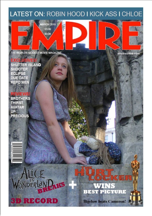
I’ve pretty much finished the magazine cover now, everything seems to work although im still unsure about the red colour of the font on the left hand side of the frame because I don’t want it to be unreadable. The page should now look like a conventional magazine cover, it’s cluttered, has a main image and the text referring to the main feature is more prominent, it advertises other content but not as obviously and also contains barcode, price and date and most obviously the title of the magazine. For now I am finished which means I can start my poster however I will come back to the magazine cover if needs be >>> 
Posted in All posts, Development | Leave a Comment »
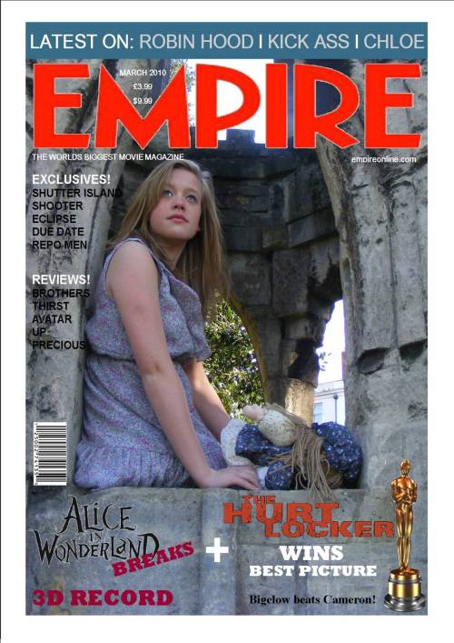
I’ve updated the font colour on my magazine so that it’s more readable, im still not too sure about it so i’ll have to experiment with more colours >>> 
Posted in All posts, Development | Leave a Comment »
I started with a few ideas for main images for the magazine cover two with a background and one an edited image >>> 


These are okay, the third one is probably the best, especially as the girl is crying which adds to the authenticity but they don’t really seem like magazine covers.
I wanted something more atmospheric, something more like the trailer rather than a more obvious staged image so I picked this one >>> 
All I had to do now was add on all the other information which I am doing in both photoshop and publisher – it’s not entirely finished yet as I haven’t added in the main text for the feature movie but I’ve added in all the other information to clutter up the page, although some of the font colour needs changing because the background is quite dark >>> 
Posted in All posts, Development | Leave a Comment »