Archive for the ‘Evaluation’ Category
Evaluation part 4 – new media technologies
Posted in All posts, Evaluation on April 27, 2010| Leave a Comment »
Evaluation part 3 – What have you learned from your audience feedback?
Posted in All posts, Evaluation on April 27, 2010| Leave a Comment »
The first and main thing I learned from my audience feedback is that you will never get it totally right because people have so many different opinions and likes/dislikes that not everyone will be always totally satisfied.
In being more specific to my work, although it wasn’t perfect, the audience feedback helped me to realise that I was on the right track – one of my polls was about which version of my poster looked better and they picked the one where the girl was looknig away which is the one I wouldv’e picked because the image of the girl is less relateable because she’s not looking directly at you.
However, they preferred the image without the hint of blue which I didn’t expect because the blue colour wouldv’e linked to my other texts as well as putting more emphasis on the mood and atmosphere – however, the blue I guess could also be a clam colour as well as cold and this film certainly isn’t meant to be calm.
It would’ve been pretty impossible to change my trailer after the audience feedback because of practicalities however, the feedback about the trailer wasn’t totally useless – it’s taught me things that I can keep in mind in any future work such as thinking more about details within a shot and also thinking more about narrative because I think narrative was my weakest point. In terms of my poster though I used the polls to help me makes decisions such as the image of the girl and the colour and tone and they were infact helpful along with considering previous research which lead to me making a decision on which version to select as part of the final constrcution.
The feedback for the magazine was helpful too beause initially I wasn’t too sure with image I’d chosen, it didn’t seem as fantasy, creepy or horific as the trailer and poster however the feedback confirmed my worries as nonsense because people said that it looked like an image that would go on a magazine – it was more about the actress in the image than the actual plot of the movie which is what magazines do, they don’t have to link in as much as the trailer and poster – plus because it’s slightly different to the other two texts it may attract another type of audience – and it isn’t totally different to the other texts one person said that it doesn’t represent horror but the tone and her expression are quite melencholy – it shows it’s not a happy movie.
Evaluation part 2 – combination of ancillary texts
Posted in All posts, Evaluation on April 27, 2010| Leave a Comment »
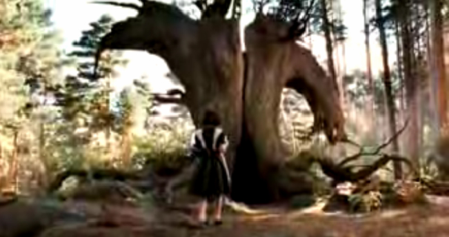
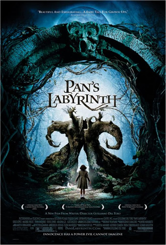
The bulk of my research was based upon the ‘Pan’s labyrinth’ movie not just in content but also with linking the three texts together; the pan’s labyrinth trailer and poster have common features such as the tone and particular images>>> 


I also managed to find a copy of empire which featured pan’s labyrinth however it was one cover out of a massive series but it still manages to fit in with the trailer and one of the other pan’s labyrinth posters. 


The poster obviously isn’t the main one chosen to advertise the movie; it’s more like the image for a magazine cover which introduces other aspects of the film like characters or actors – this image of this character is also in the trailer creating a link between all three.
This is what I wanted for my three texts – I wanted certain images or themes from each individual to be in all three in order to create a link between them which I feel I managed to do. 


I’ve only picked one shot from my trailer but there are quite a few I could’ve used which would’ve linked more to the poster or trailer but the one thing they have in common is the main character, I wanted her to be the central link because the movie is very much about dark experiences even if this is only subtly hinted at. All three of these texts also have a blue tinge to them to add in that coldness which I think is needed to set the mood however they also all radiate their own mood – the poster seems more horrific, the trailer rather melancholy and the magazine seems more reflective.
As pan’s labyrinth was the main influence on my work it meant the target audience for my work would be pretty much similar if not the same. The trailer is about a young girl losing her innocence to evil powers and darkness portrayed in a ‘fantasy’ world. Although some of the shots in my trailer don’t look as horrific as the pan’s labyrinth ones it doesn’t mean the film as a whole wouldn’t be like that so I wanted my target audience to be about 15 and up because of the potential disturbing scenes and themes. Pan’s labyrinth definitely conveys the horror of the film successfully because of the terribleness of the ‘pale man’ character featured in all three of their texts. 
Also the main poster also conveys a creepy twisty feeling of darkness from the blue tones and wired brambles. 
I think maybe my texts aren’t as successful in this area, I think there is more I could’ve done in my trailer and for my magazine to make it seem horrific and creepy because the magazine especially looks quite tame and definitely suitable for a younger audience. My trailer is sort of getting there, like I said previously, there aren’t really any horrific shots (although that was mainly because of practicality) and it doesn’t seem as creepy as I would’ve preferred. My poster is probably the most successful of the three; I think the dulled colour with the hint of blue makes it colder than the other two which have elements of brighter colours and the dark deathliness of the trees in the poster seem to loom over you, it’s really quite creepy.
However, this isn’t necessarily a bad thing because it could potentially attract other people rather than the audience I was trying to reach; the difference between the three texts are essentially working to reach different people rather then making all the texts pretty much the same and only attracting one sort of person.
As for when in the films marketing the texts should appear; I think that the teaser trailer and poster should be quite early on, the trailer more so than the poster because that is one of the main conventions of a teaser; it’s released a long while before the movie so as to ‘tease’ the audience. The poster maybe a little while after the trailer to keep people interested, a way of stringing out the marketing and I think the magazine should be quite a lot later after longer or different versions of the trailer have been released because more people will know about the film by then and so be more interested in reading the article. It shows how important it is to advertise the film using more than one text because it spans a wide variety of media so getting the message out to different types of people: those who read magazines, people who use the internet etc. Each text plays their own part in attracting an audience but essentially work together to pull different people in.
The most important element of the three texts combining together is their effectiveness – the audience feedback part of my research is helpful in realising whether the texts were effect – whether they achieved what they were designed and created for. I think I managed to reach the audience and coney through the texts what I was hoping – In the audience feedback recordings, in which I interview three people about my texts, they all identify correctly the genre and pick out striking images which are the ones I wanted them to like the girl crying or the bleeding effect in the title screens.
Evaluation part 1 – forms and conventions
Posted in All posts, Evaluation on April 26, 2010| Leave a Comment »
Part of this powerpoint is on video however the videos do not work on slideshare – the first video my trailer can be viewed under the ‘final construction’ category and here’s a link to the other video >>>
Recent Comments
Categories
